A guide from the curator
Dating and valuing vintage postcards
How to read a card's era from its back, its stamp box and its postmark - and what makes one worth keeping.
A postcard carries its date on it, if you know where to look. Between the picture, the printing, the back layout, the stamp, the postmark and the handwriting, almost every card in the museum can be placed to within a decade and usually to within a year. This guide is the part of the museum's practice that goes on before a card is catalogued: looking at it, dating it, and deciding whether it is a document or only a picture.
The four eras of the picture postcard
Postcard collectors divide the form into four broad periods. The boundaries are slightly different in the UK, the US and the continent, but the shape is the same everywhere.
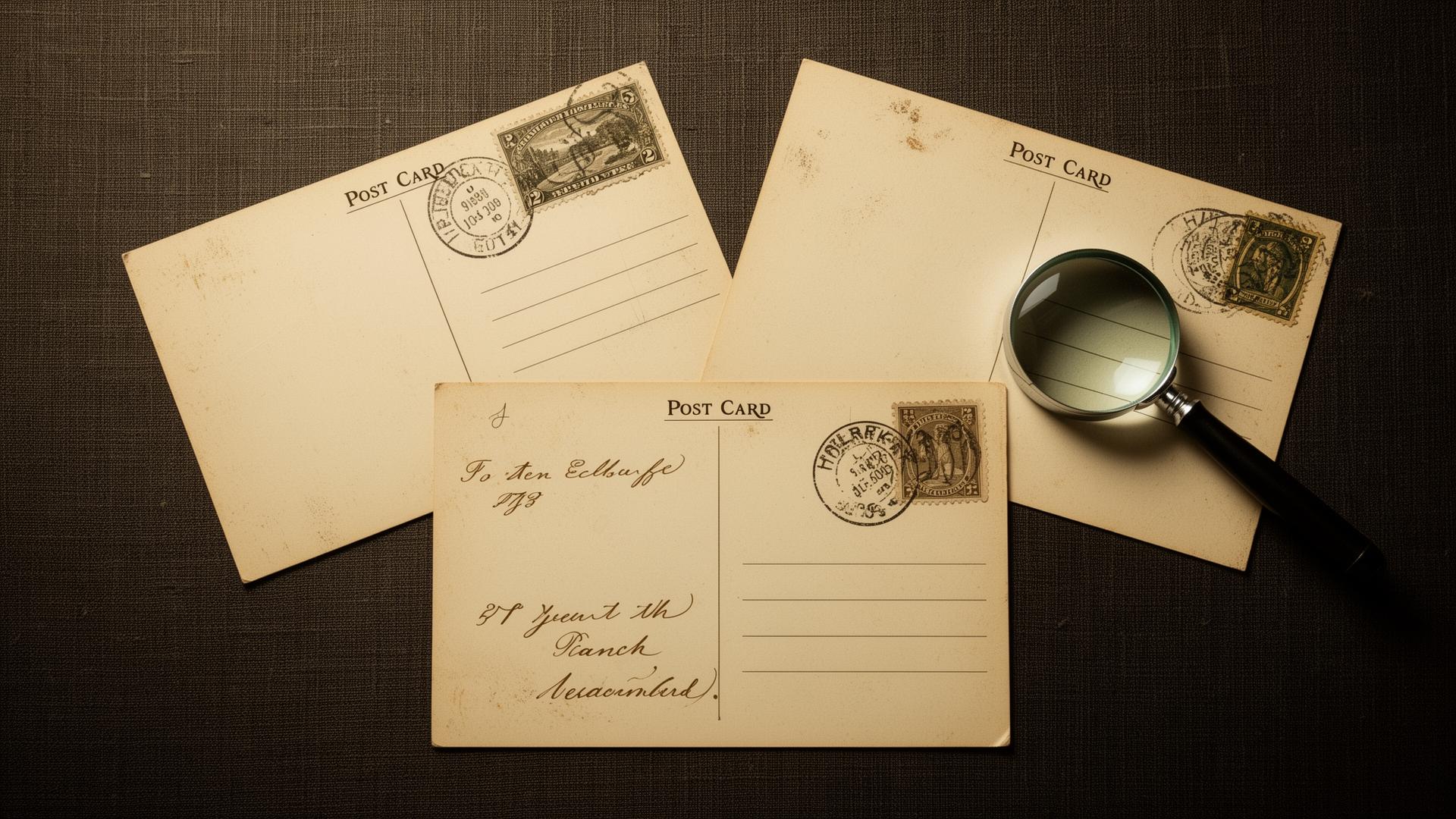
1. Pre-Divided Back (to 1902 UK, to 1907 US)
The back of the card is reserved entirely for the address. The sender wrote their message across the picture, around it, or on a narrow margin. These are the earliest picture postcards, often called "court size" in Britain. They are scarcer than later cards, and a clean undivided-back card of a named place usually sells well above a comparable Edwardian view.
2. Divided Back / Golden Age (1902 to 1915)
A vertical line down the centre of the back divides message from address. The picture side is free of writing and often free of borders too. This is the Edwardian golden age - the single largest body of surviving cards, the period when the picture postcard was the cheapest, fastest and most common form of personal communication in Britain. Tuck, Valentine's, Bamforth and Photochrom are the names to know.
3. White Border and Linen (1915 to 1945)
From around 1915, printers in the US (and later in Britain) framed the picture with a white border to save ink at the edges. From the early 1930s, the same publishers moved to "linen" cards: a textured paper that took bright, slightly unreal colours - the look of pre-war American roadside cards and 1930s British seaside humour.
4. Photochrome / Chrome (1939 onwards)
Glossy full-colour photographic cards, mass-produced from Kodachrome and similar processes. Dominant by the 1960s and still the standard format of the tourist postcard today. The commonest cards in any junk-shop box, and almost always the least valuable - except for very early chromes of subjects that disappeared soon after.
Real Photo Postcards (RPPCs)
Running alongside the four printed eras, from roughly 1900 into the 1950s, are real-photo postcards: actual photographic prints on postcard-backed photographic paper, made in small runs by local photographers. They are the most valuable kind of card, because each one is a primary photographic document of a place, a shop, a person or an event - often the only surviving photograph of its subject.
The easiest way to date an unposted RPPC is the stamp box. The paper manufacturer printed a small box where the stamp would go, and the design of that box changed every few years. A few of the common ones:
- AZO with four triangles pointing up: 1904 to 1918.
- AZO with two up, two down: 1918 to 1930.
- AZO with squares in the corners: 1925 to 1940s.
- VELOX with diamonds in the corners: 1907 to 1914.
- KODAK: post-1950 in most variants.
- DEFENDER, NOKO, ARGO: roughly 1910 to 1930.
A full stamp-box reference is worth keeping; Playle's online guide is the standard collector resource.
What makes a postcard valuable
In rough order of importance to a collector:
- Subject. Named shops with legible shopfronts, identifiable streets, named people, ships, trains, aircraft, disasters, political campaigns, suffragette cards, ethnic and occupational portraits. The more specific the subject, the smaller the print run is likely to have been.
- Process. A real-photo card almost always outvalues a printed lithograph of the same subject.
- Condition. No creases, no album corners, no thinning where a stamp was lifted, no faded ink, no trimmed edges.
- Postmark. Clear and dated; rarer cancels (travelling post offices, ships, military field post, small village offices) add significantly.
- Stamp. Scarce stamps on cover can outvalue the card; even routine stamps add provenance.
- Message. A dated, located, clearly handwritten message ties the card to a person and a place. A card signed by, or sent to, someone identifiable can add a great deal more.
- Publisher and artist. Named artists (Mucha, Kirchner, McGill, Attwell, Wain) and prestige publishers (Tuck Oilettes, Detroit Publishing) carry premiums on the name alone.
Rough value bands
Indicative only - the market moves and individual cards surprise - but a useful frame for sorting a box.
- £1 to £5. Common Edwardian topographical views of large towns and standard seaside resorts. Mid-century chromes. Most unposted greetings cards.
- £5 to £15. Undivided-back cards of named places; small-village views; well-postmarked Edwardian cards of smaller towns; comic and song cards by named publishers in clean condition.
- £15 to £50. Real-photo cards of identifiable streets, shops or named events; Tuck Oilettes of scarcer subjects; named-artist cards in fine condition.
- £50 to £200. RPPCs of named people, named shops with legible signage, early aviation, ships, disasters, suffragette and political campaigns.
- £200 and up. Rare named-artist cards in prime condition, important historical events, first-flight and first-day covers, very early Mulready-style mail.
Frequently asked questions
The questions visitors ask the museum most often about dating and valuing old postcards.
Continue your visit